Project context
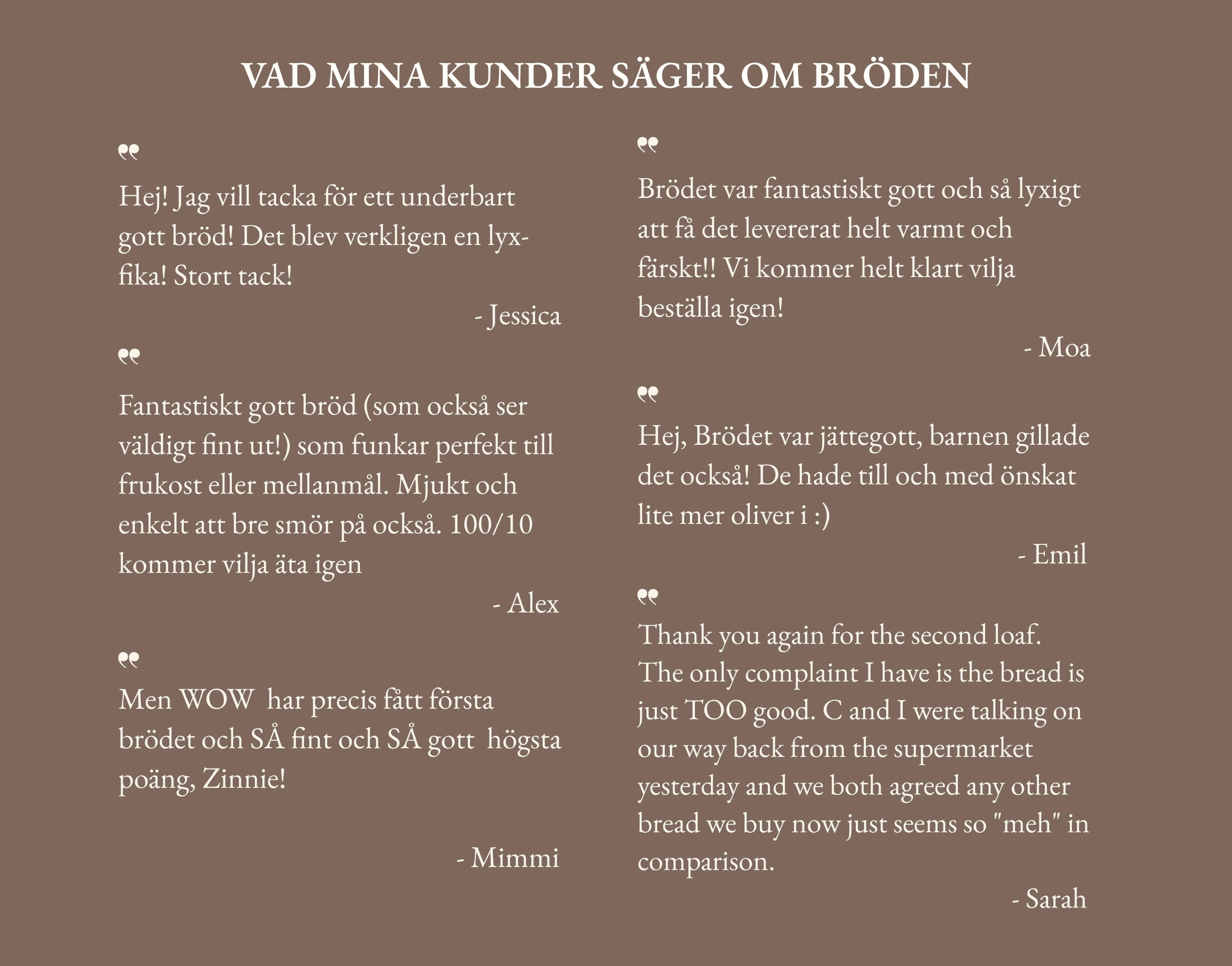
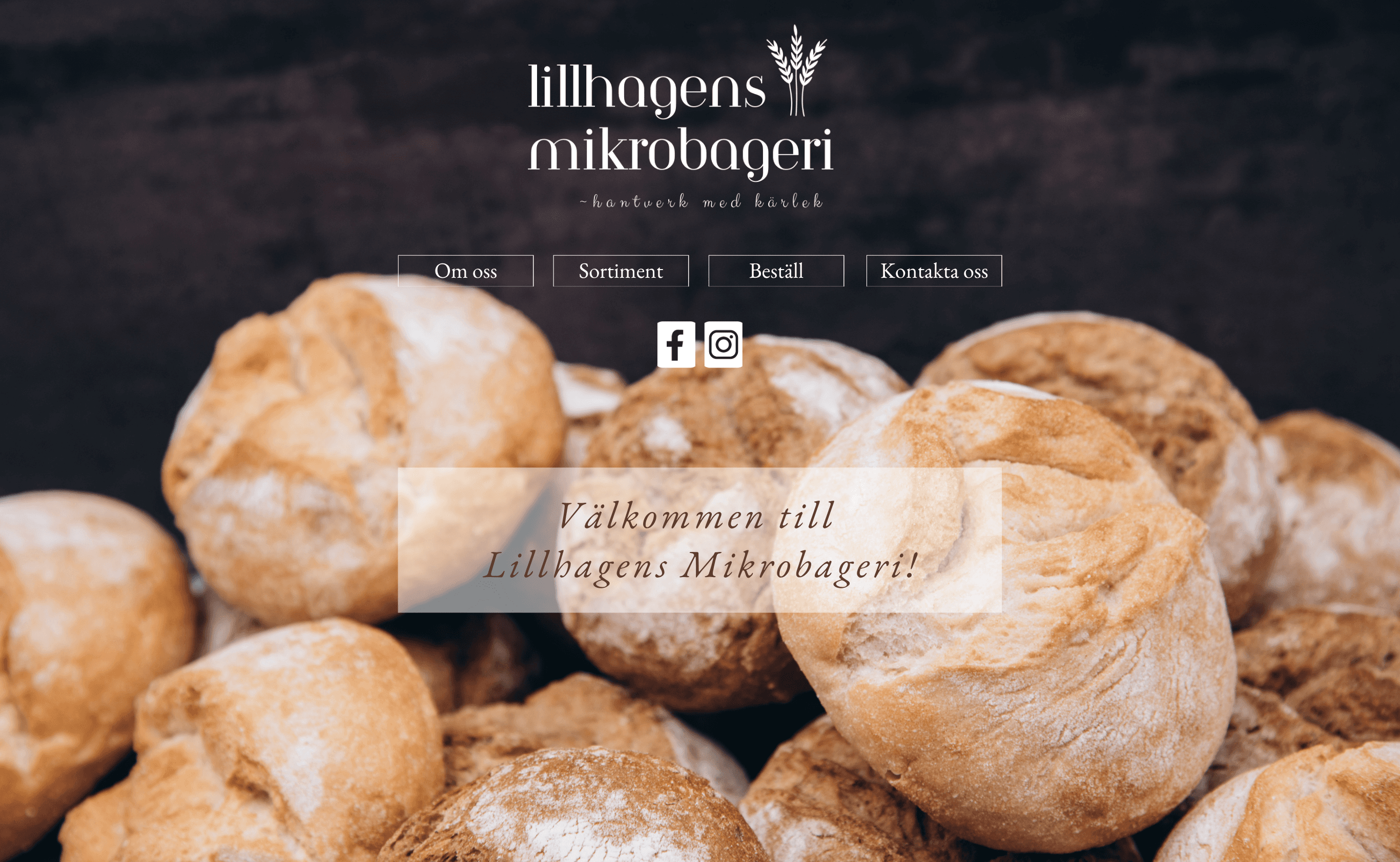
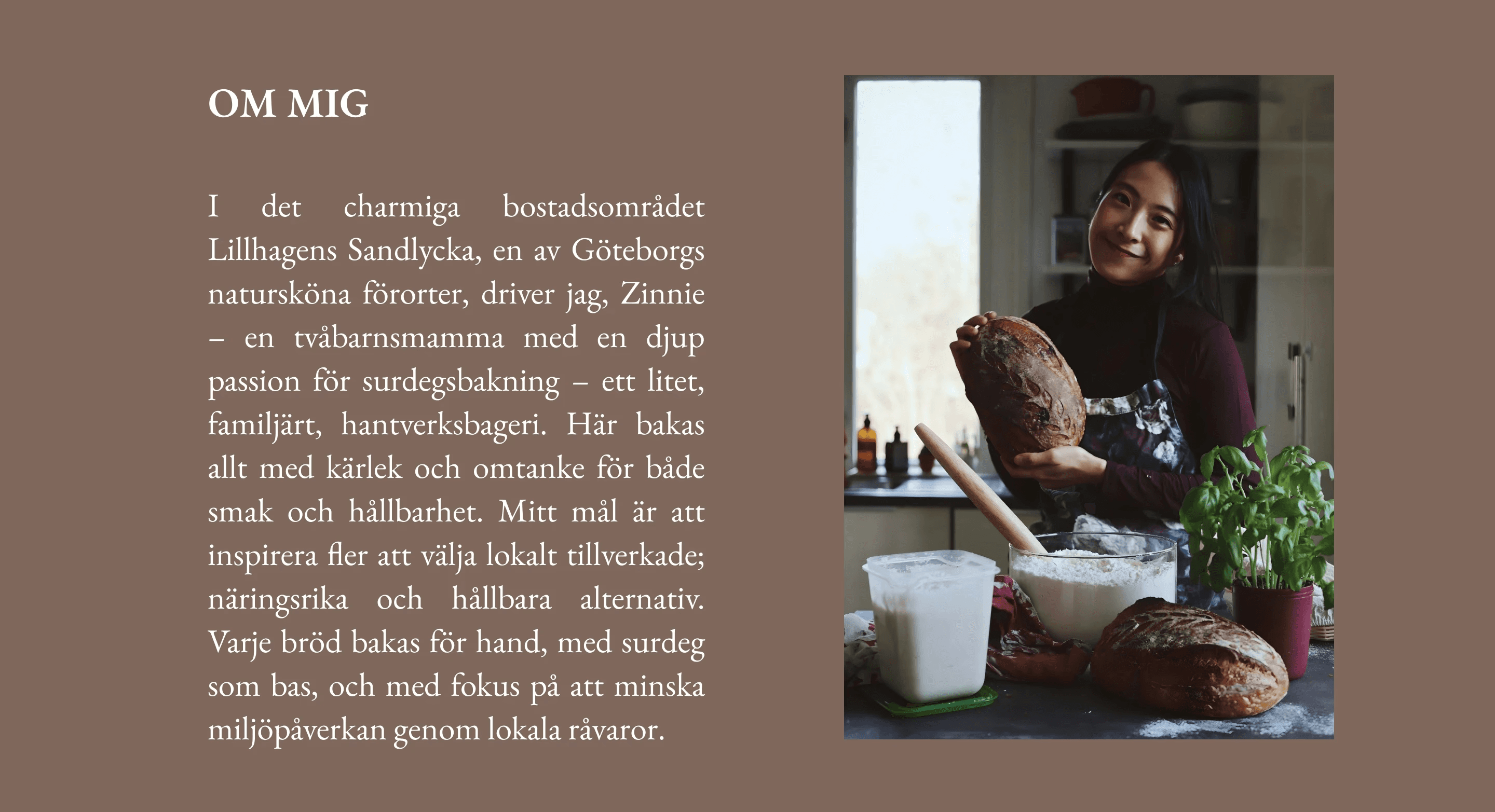
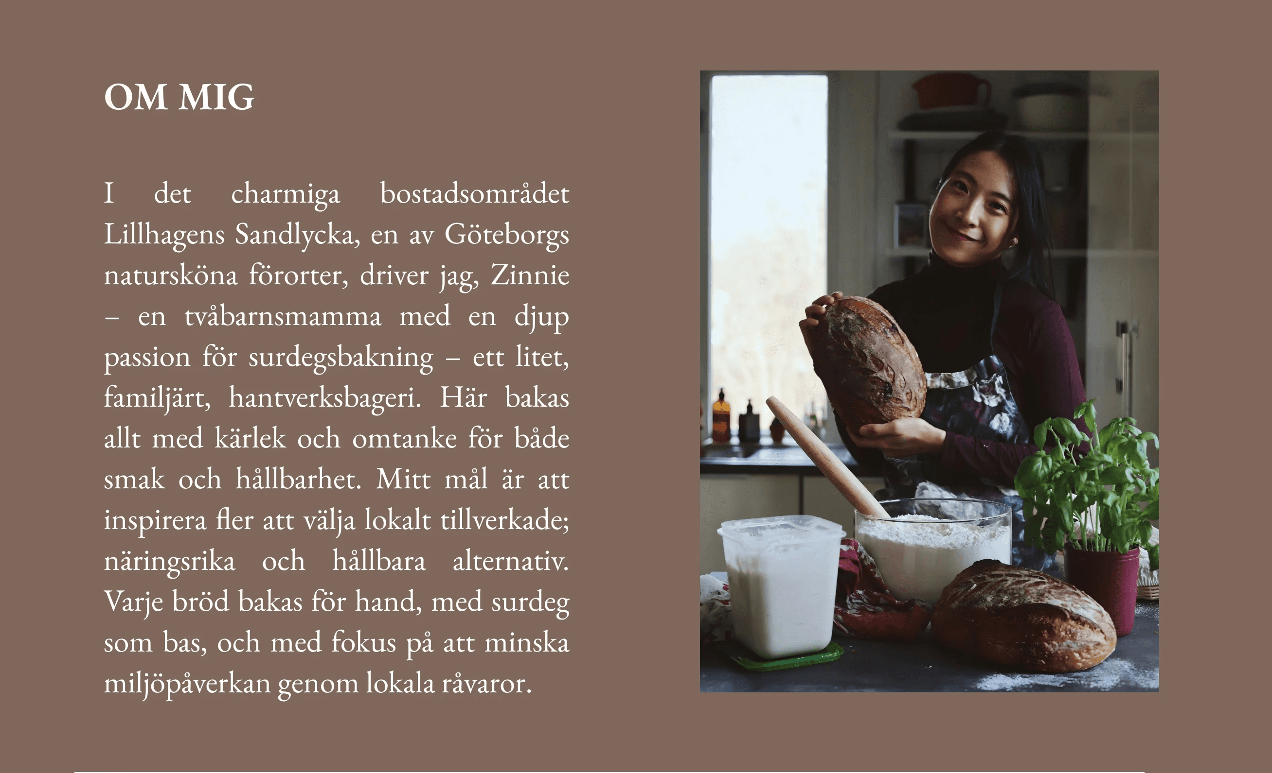
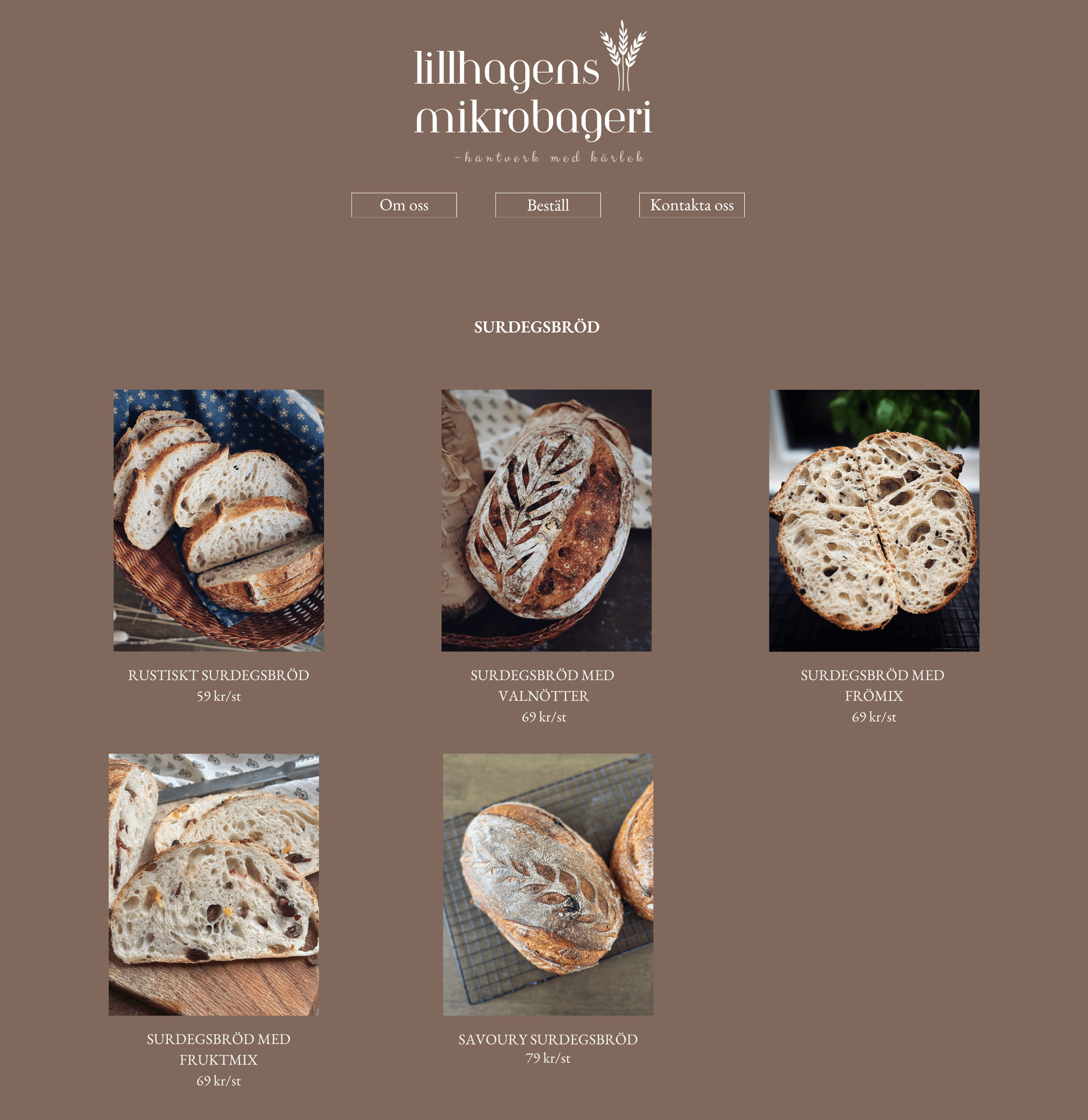
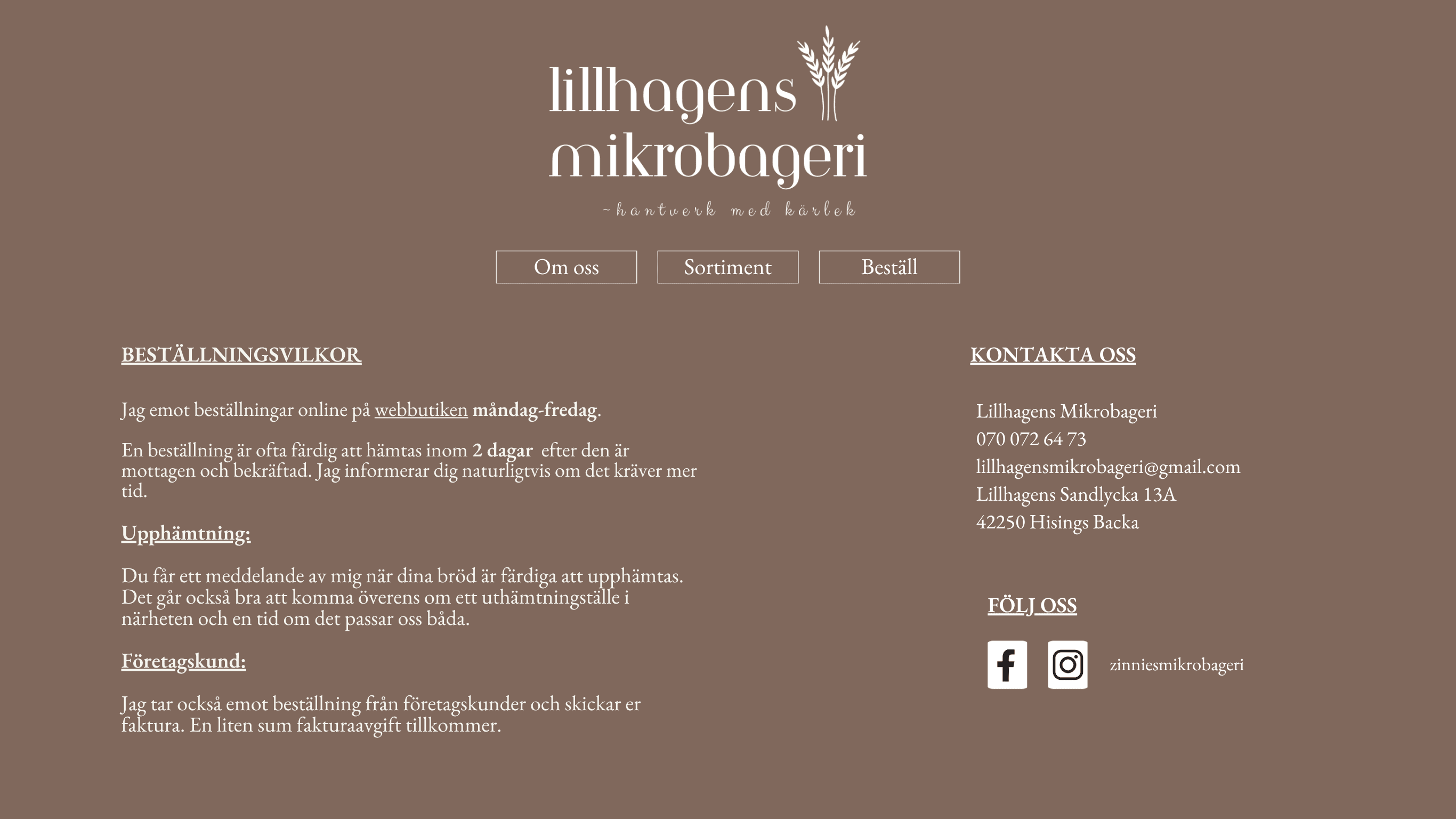
In 2024, I founded Lillhagens Mikrobageri, a boutique home bakery in Lillhagen. At the time, I built a simple website using Canva to serve as a digital catalog. While it successfully showcased my products and met Livsmedelsverket transparency regulations, the site had significant UX limitations: it was purely informational, lacking direct communication and e-commerce capabilities.
The pivot
After transitioning into the field of UX Design, I decided to revisit my former business’s touchpoints. I realized that while the brand heart was there, the user journey was fragmented. Customers had to leave the site to order via Instagram or Email, creating high friction and potential drop-offs.
This case study is a proactive redesign aimed at transforming a static information hub into a high-converting, end-to-end shopping experience.
The new version
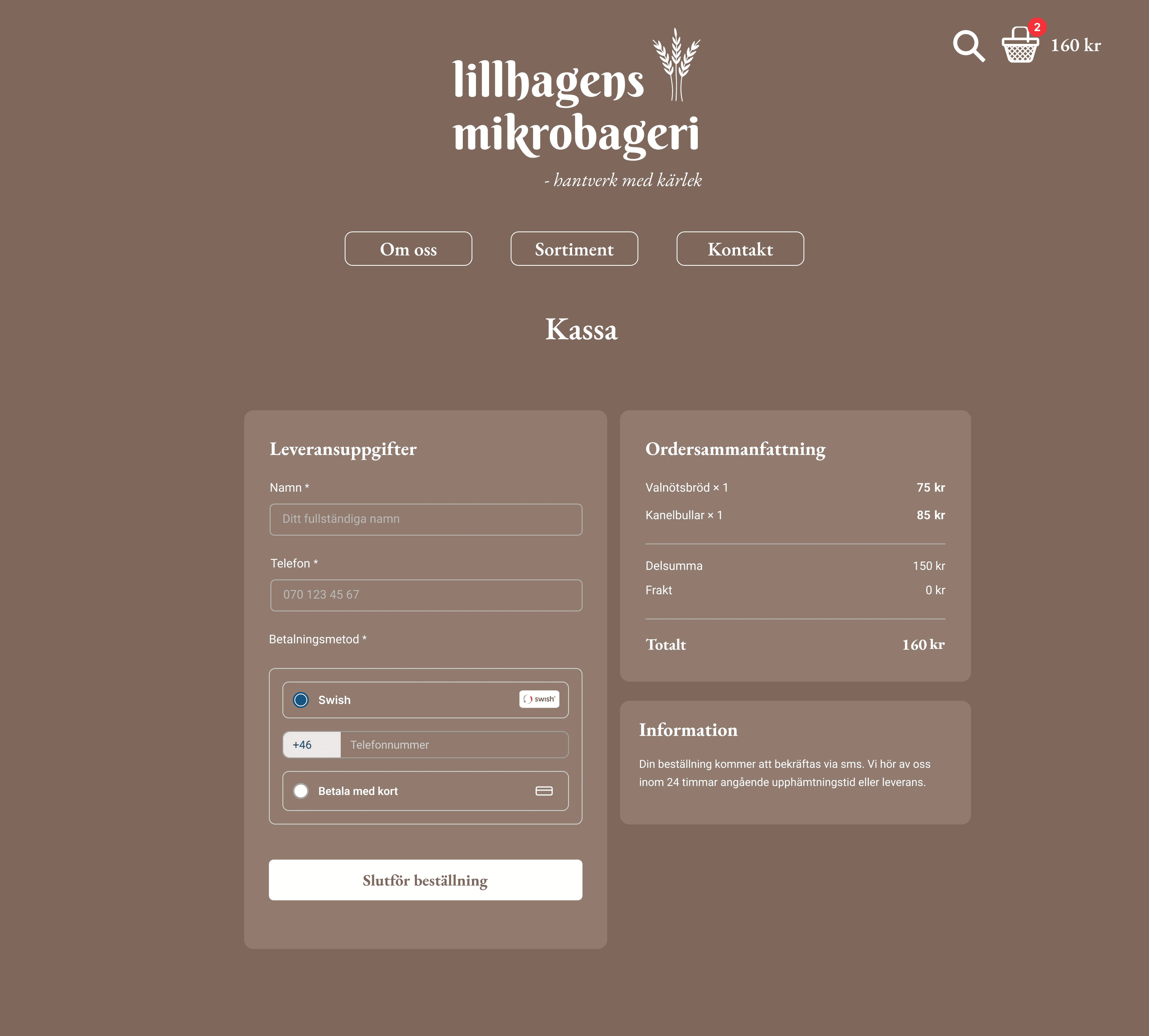
The goal of this redesign is to create a seamless, online shopping experience: Integrated Checkout with Swish & Card Payments to transform the site into a high-converting e-commerce platform.
I added the checkout flow from shopping cart to payment, including Swish—Sweden’s most trusted and preferred mobile payment method, alongside standard card options.
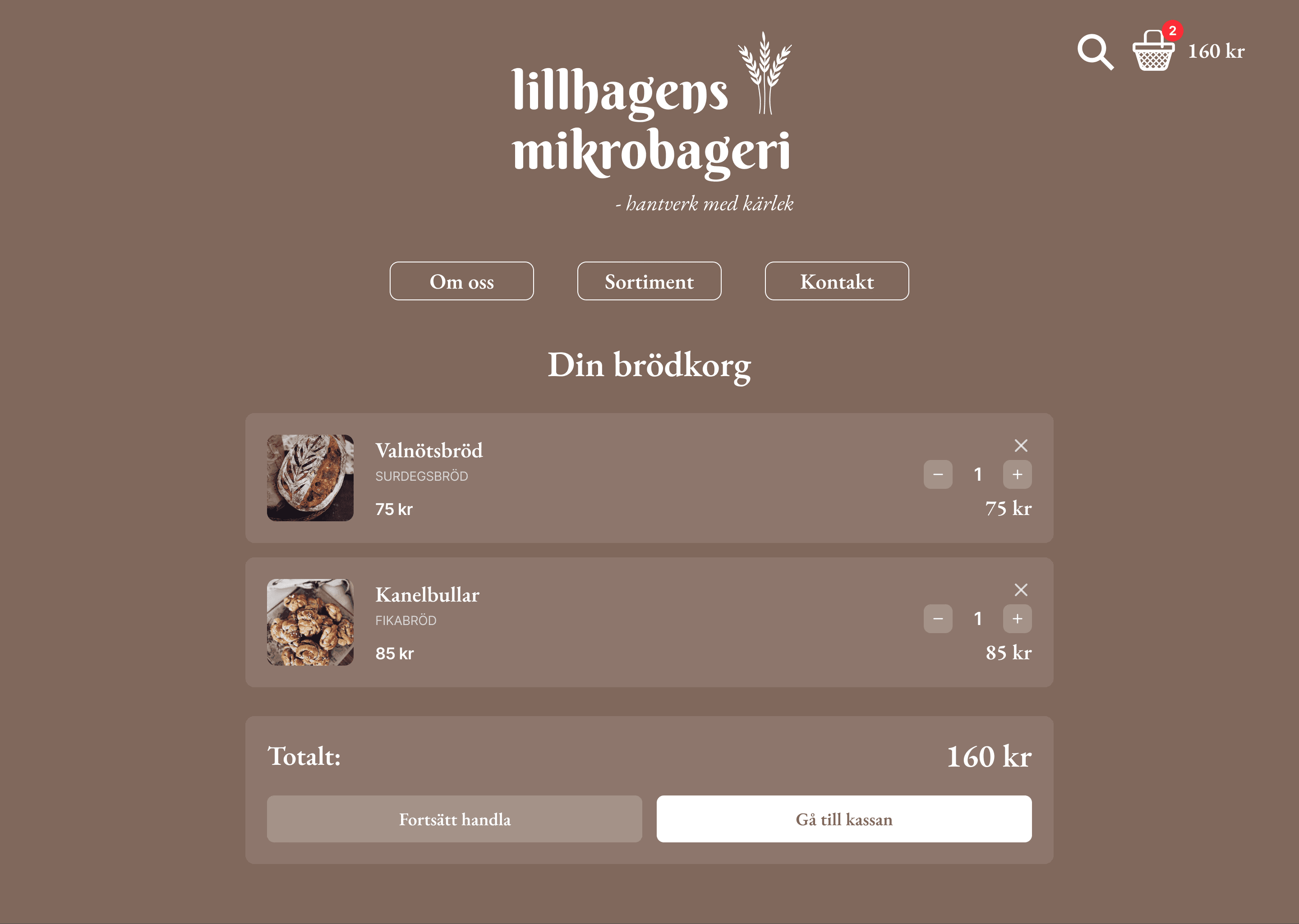
By integrating Swish, I leveraged a familiar and secure mental model, significantly reducing "checkout anxiety."
For the business, this automated flow replaces manual bank transfers and messaging, ensuring that every order is paid for and confirmed instantly.
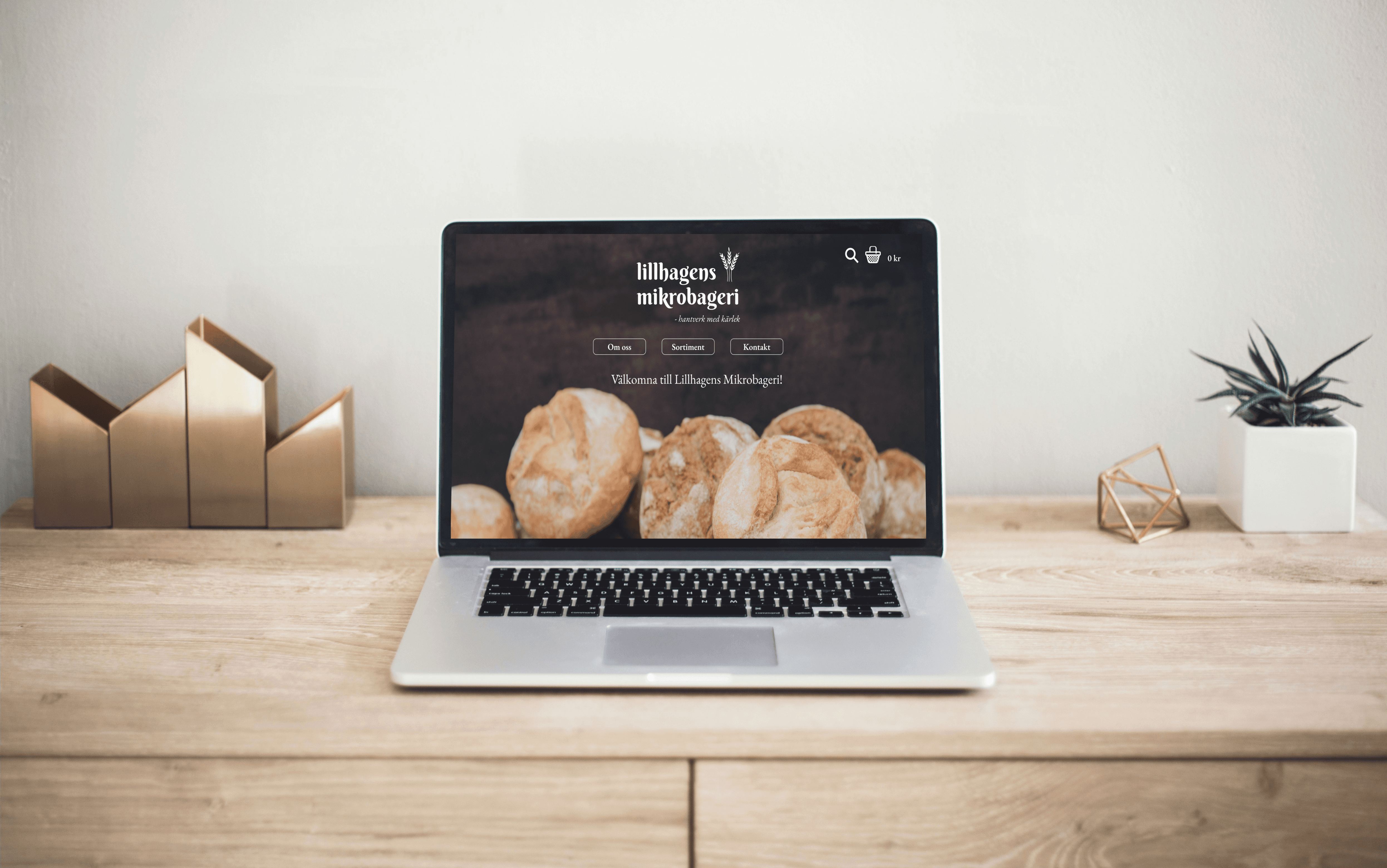
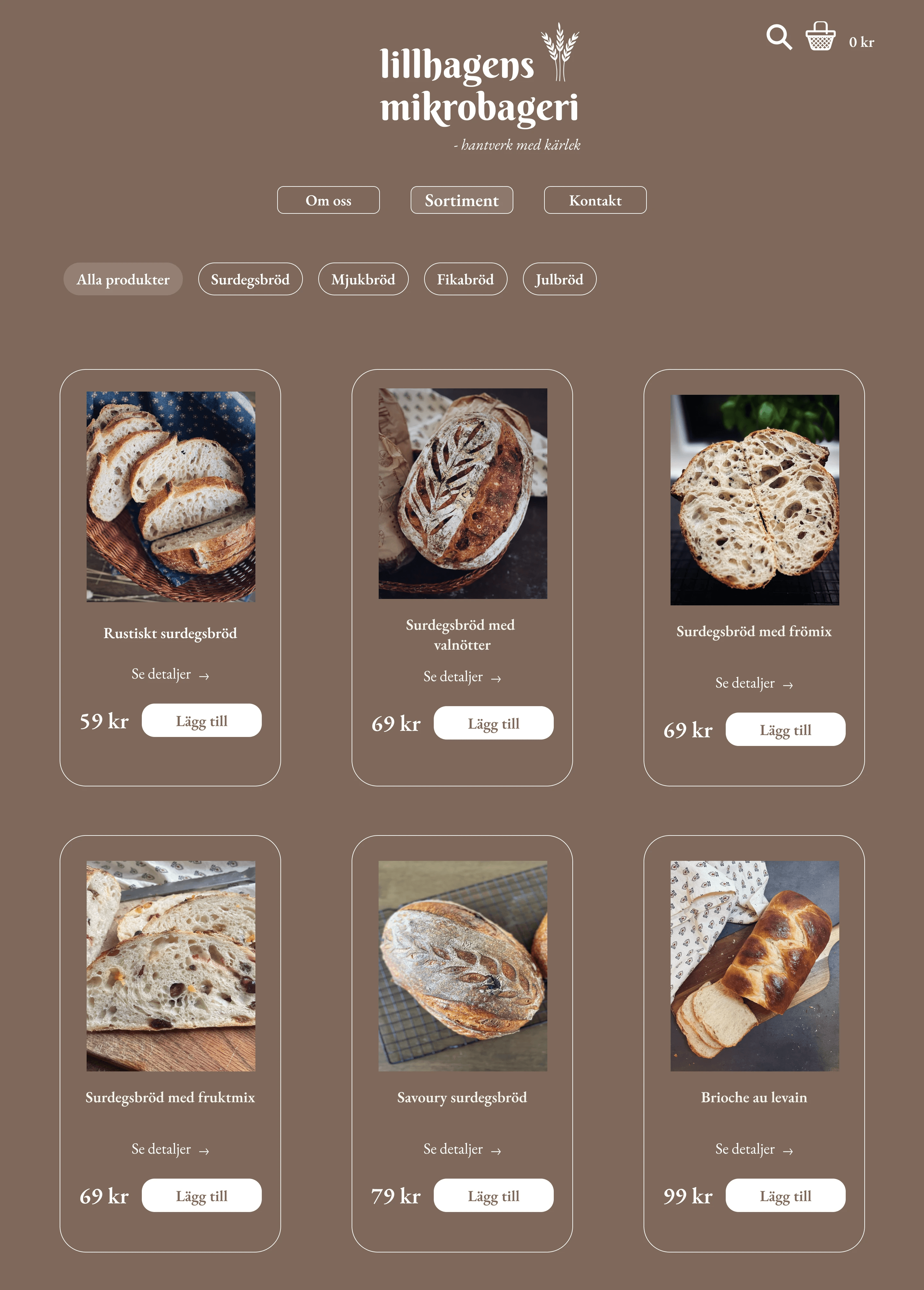
Compared to the previous verison, the new web version is now having a more refined visual identity: A cleaner, more professional layout with product cards that establishes trust and reflects the premium quality of the baked goods, not just a visual catalogue. Customers can also filter product categories in the Sortiment.
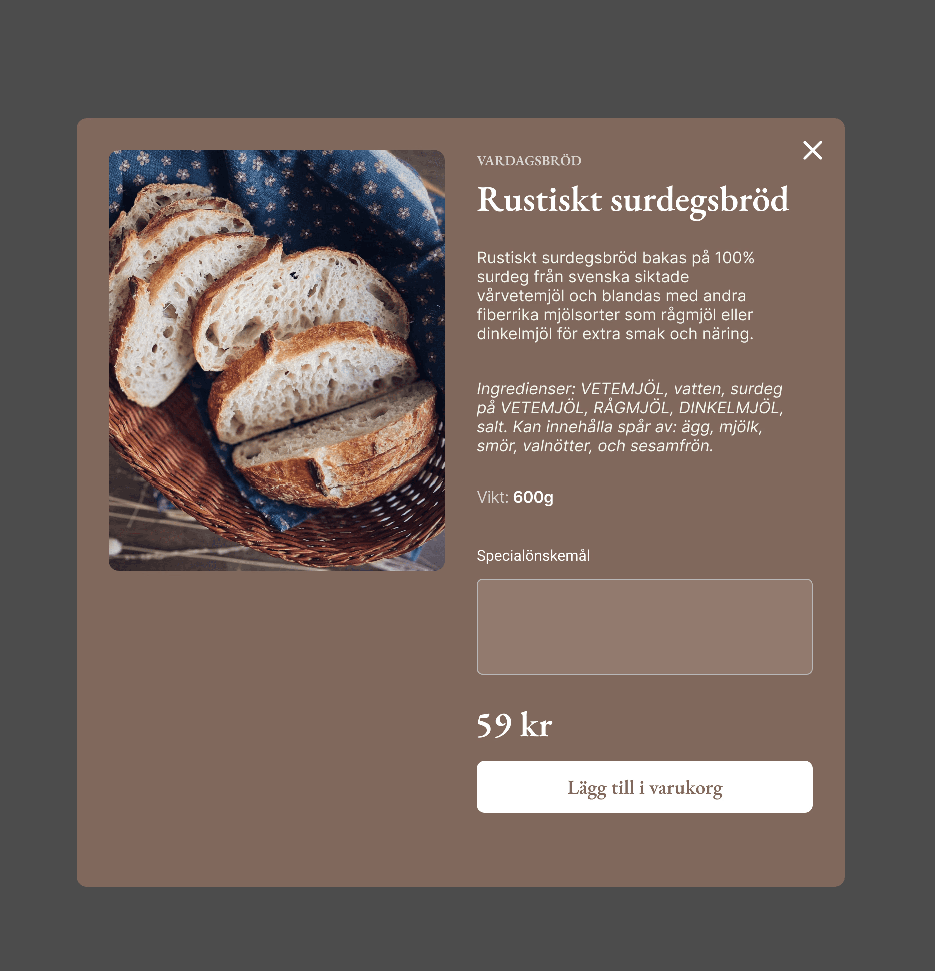
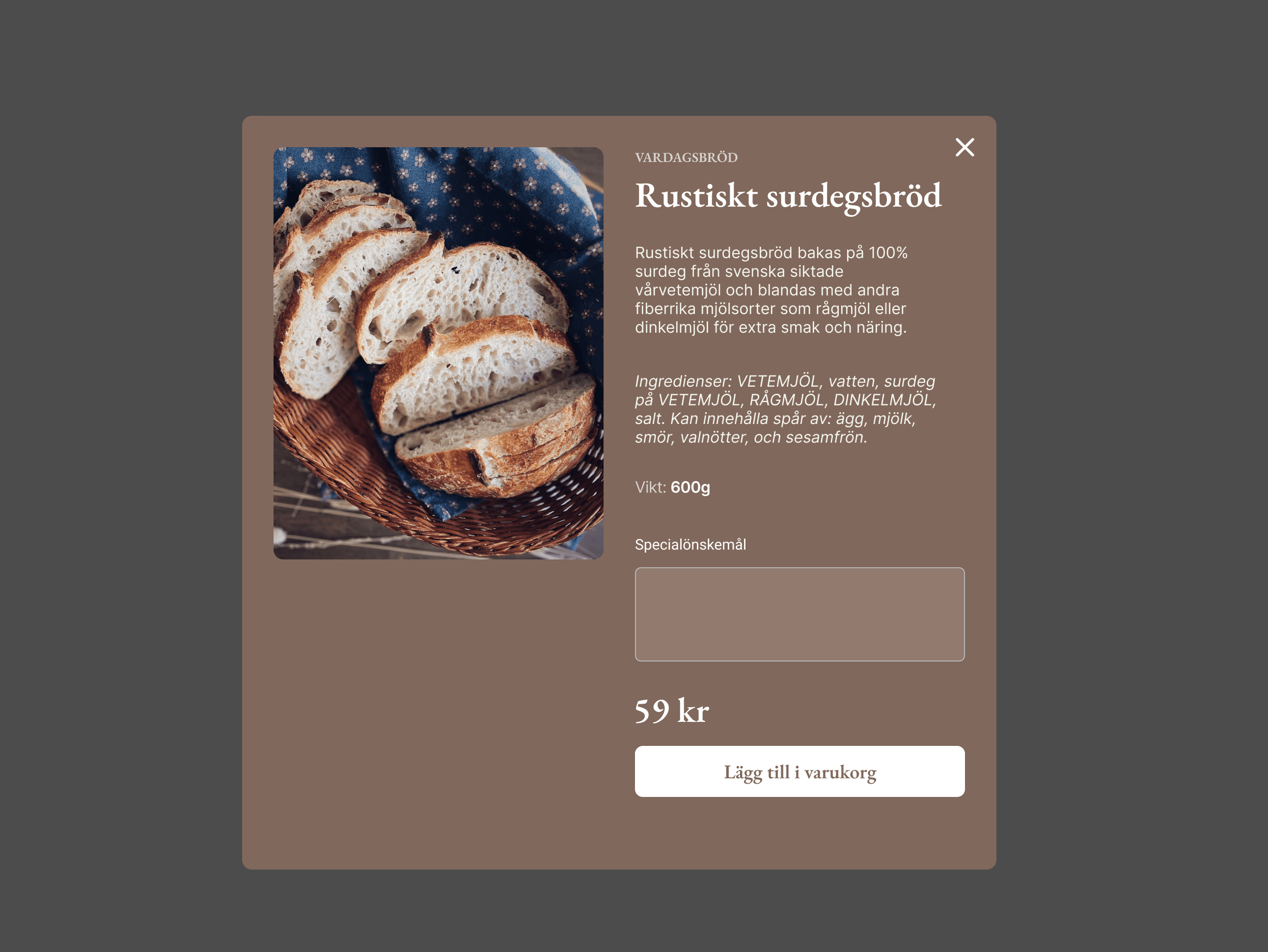
For better shopping experience, users can also browse, customize their order by messaging the baker (via a dedicated "Special request" field). I restructured the product information to prioritize essential data (description, allergens, ingredients, etc.) as per Livsmedelsverket standards, but with a much cleaner visual layout to avoid cognitive overload.
Visual Identity & UI Refresh
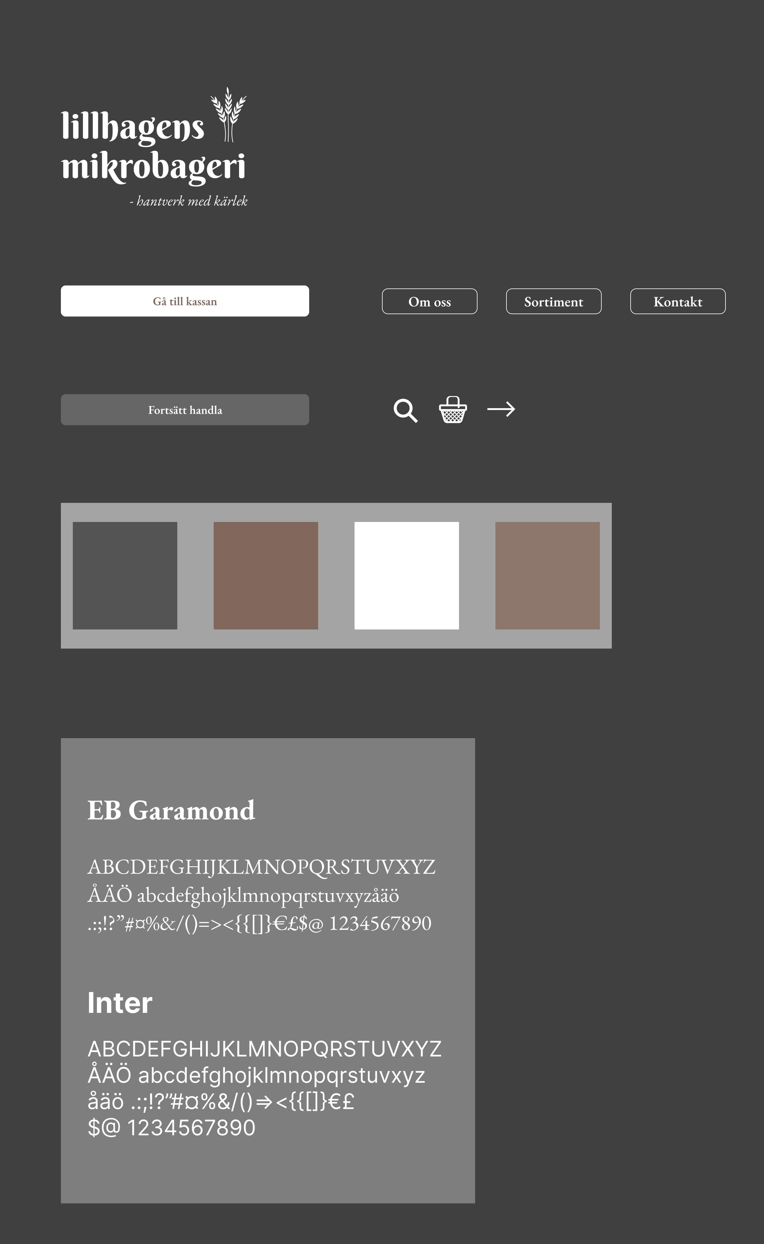
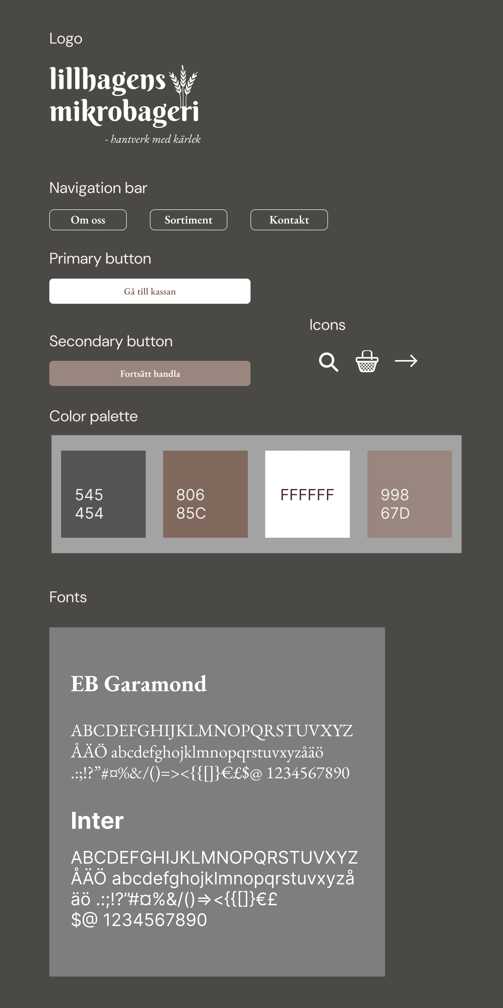
Logo Redesign: I simplified the original logo for better scalability and instant recognition.
Intuitive Navigation: To reduce cognitive load, I implemented a set of familiar, universal icons (Shopping Basket, Search, Navigation Arrows), ensuring users can navigate the shop effortlessly
Clear Hierarchy & CTAs: I introduced a structured button system with distinct Primary and Secondary CTAs. This guides users clearly toward key actions like "Add to cart" or "Order now," eliminating any navigation confusion.
Typography & Color:
A pairing of EB Garamond (Headings) for a premium, rustic feel and Inter (UI/Body) for modern legibility.
A warm, earthy brown palette was chosen to evoke the rustic essence of freshly baked bread, creating an inviting and authentic digital atmosphere.

Conclusion & Reflection
Redesigning Lillhagens Mikrobageri was more than just a UI exercise; it was a bridge between my past as an entrepreneur and my future as a UX Designer.
Key Achievement: I successfully transformed a static digital menu into a fully functional e-commerce concept. By integrating localized solutions like Swish and refining the Information Hierarchy, I created a journey that respects both the brand’s rustic roots and the user’s need for efficiency.
The Power of UX: This project taught me that even the most passionate business can be hindered by "friction." A beautiful website is useless if the user doesn't know how to buy the product.
What I’d do differently: If the bakery were still active, my next step would be conducting A/B testing on the checkout flow to see if the "Special Instructions" field affects conversion rates or if users prefer a more automated customization process.
Final Thought: Lillhagens Mikrobageri may have closed its doors, but this redesign ensures its spirit lives on through a seamless, user-centric experience. It stands as a testament to my belief that great design is the heart of any successful business.