MEDTECH • 2026
Matmys
A grocery app that offers flexible, customizable options for selecting fruits and vegetables
Duration: 3 months
My role: UX Designer
Scope: Conceptual Case Study, Design Thinking process
Focus: Grocery app, online shopping experience
Project context
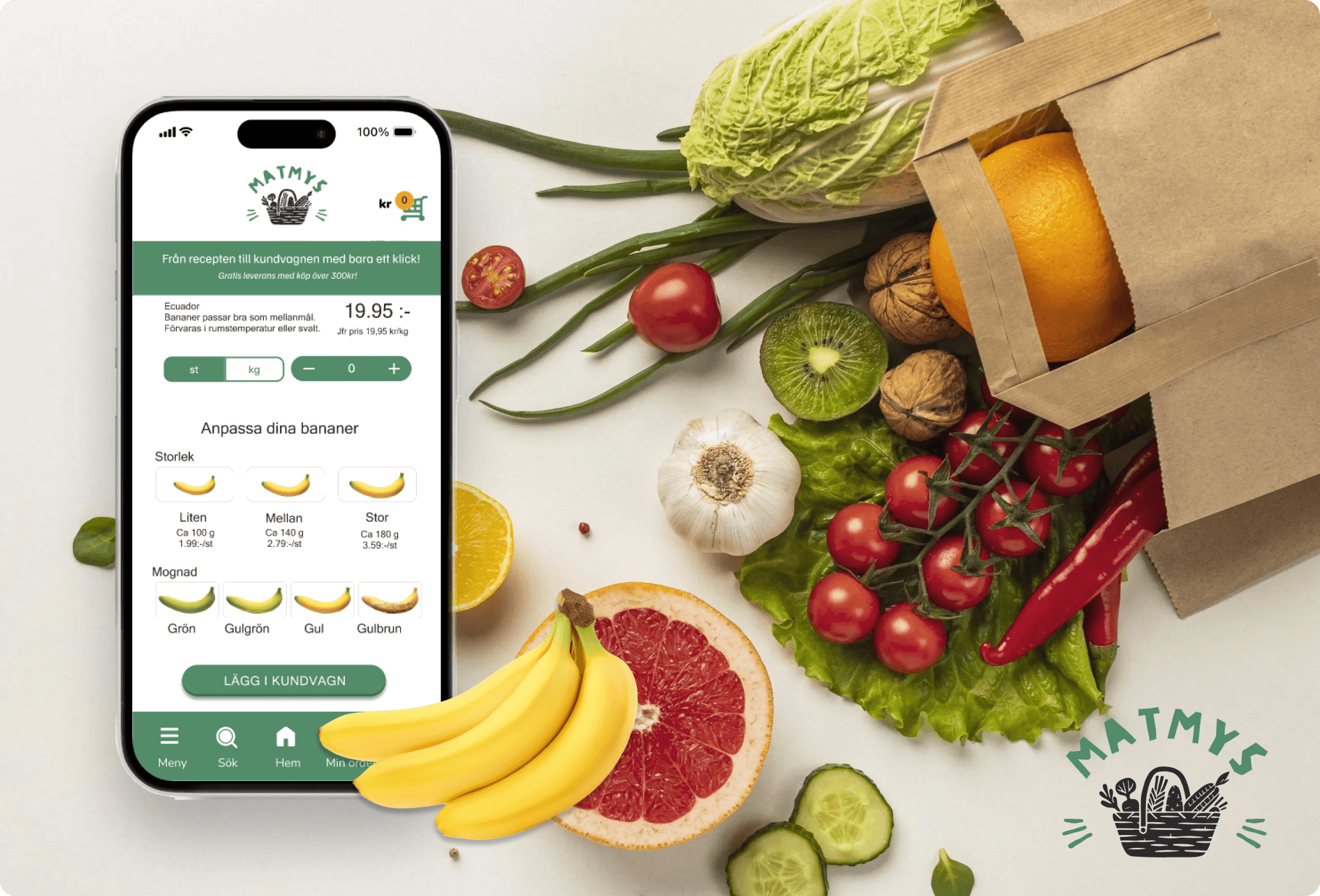
Matmys is a conceptual mobile application designed to bridge the "Trust Gap" in online grocery shopping, specifically focusing on the fresh produce category. The project targets young adults (ages 20-30) in Sweden, a demographic that values convenience but remains skeptical about the quality of digital food sourcing.
Goal
As a UX Designer, my objective was to uncover the underlying reasons why this target group hesitates to shop for groceries online and to design a feature-driven solution that enhances their confidence and engagement with digital platforms.
Design thinking process
As UX designer working on the first project, it’s important for me to work in a structured and thoughtful way, because I genuinely care about our users and aim to keep them at the center of everything I do.
I followed a Design Thinking process to ensure I understand our users from the very beginning.
I started with the Empathize phase by conducting in-depth user research, then moved on to Define, Ideate, Prototype, and Test.
Throughout the last three phases, the solution was iterated continuously —to make sure the design truly addressed users’ needs.
Empathize
Conducted mixed-method research, combining surveys and user interviews.
Synthesized and analyzed findings to uncover key patterns in user needs, behaviors, and pain points.
Define
Created personas and user journey maps.
Clearly defined problem and solution spaces.
Formulated problem and goal statements
Ideate
Facilitated brainstorming sessions.
Created user flows.
Prioritized features based on user needs.
Prototype
Rapidly sketched paper wireframes based on user flows.
Created low-fidelity prototypes and storyboards in Figma.
Translated low-fidelity concepts into high-fidelity prototypes
Test
Developed test scenarios.
Conducted usability testing and A/B testing on both low- and high-fidelity prototypes.
Collected feedback and iterated on the design
Personas
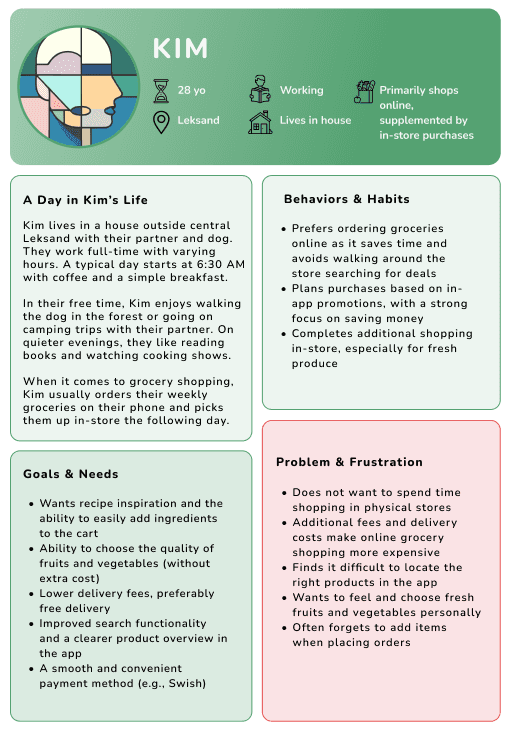
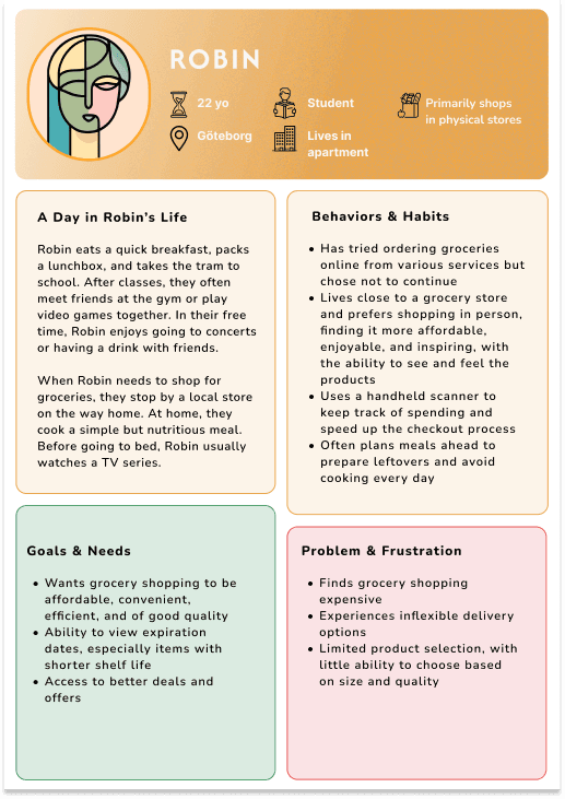
After synthesizing insights from both interviews and surveys, two key personas were developed representing typical grocery shoppers: Kim, who primarily shops online, and Robin, who prefers the in-store experience.
Painpoints and Key insights
Delivery time is not flexible and needs planning
Quality of fruit and vegetables is the major concern among users
Shipping costs make the onine shopping experience less motivating
After identifying key user pain points and priorities, I facilitated a discussion with the team to define what to focus on. Given the range of challenges uncovered, I advocated for prioritizing the quality of fruits and vegetables as a starting point. As this was a conceptual UX project, I emphasized addressing areas where design could have the most direct impact, rather than factors like shipping costs or delivery times, which depend on broader business and operational decisions beyond the scope of UX.
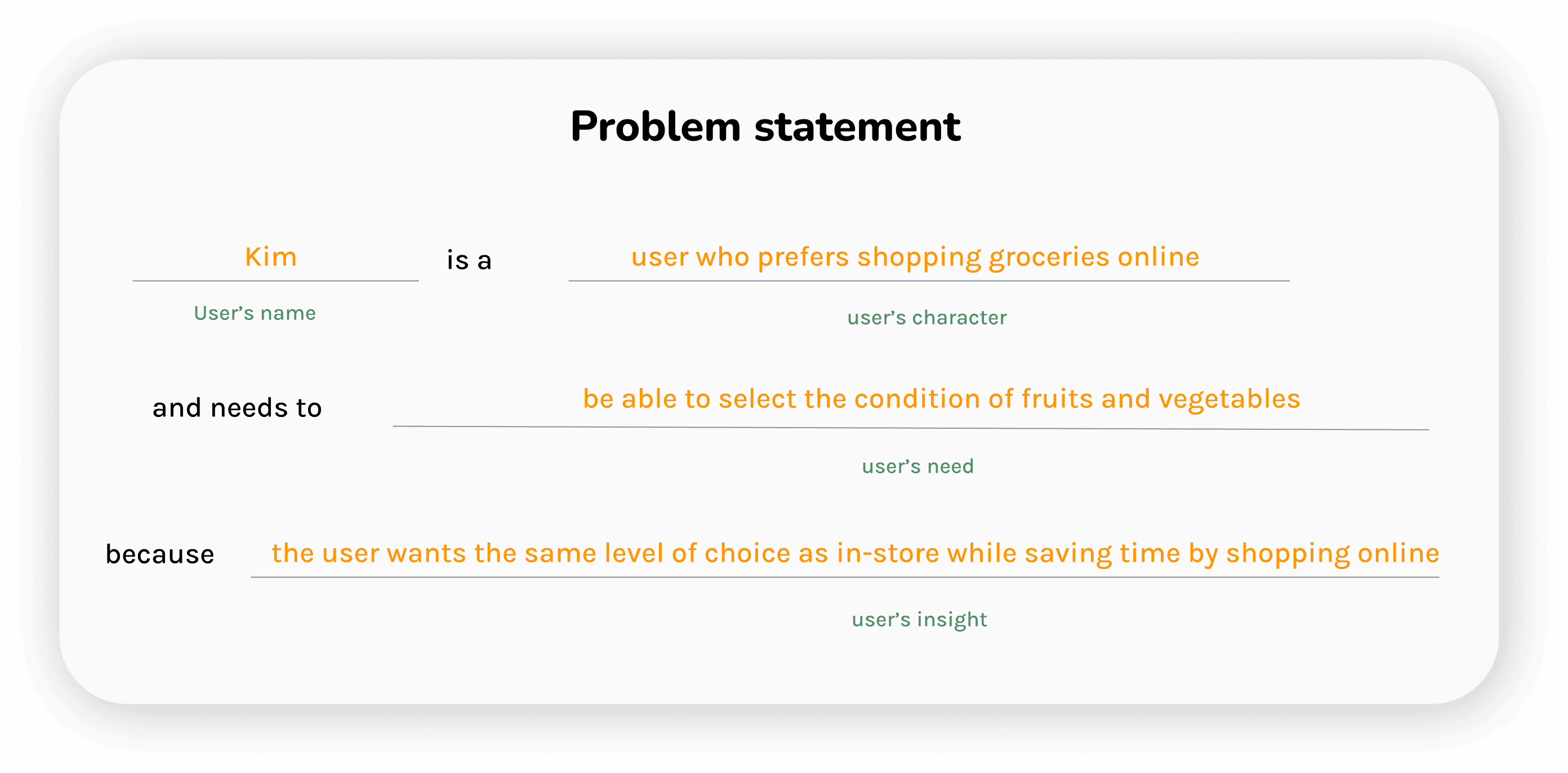
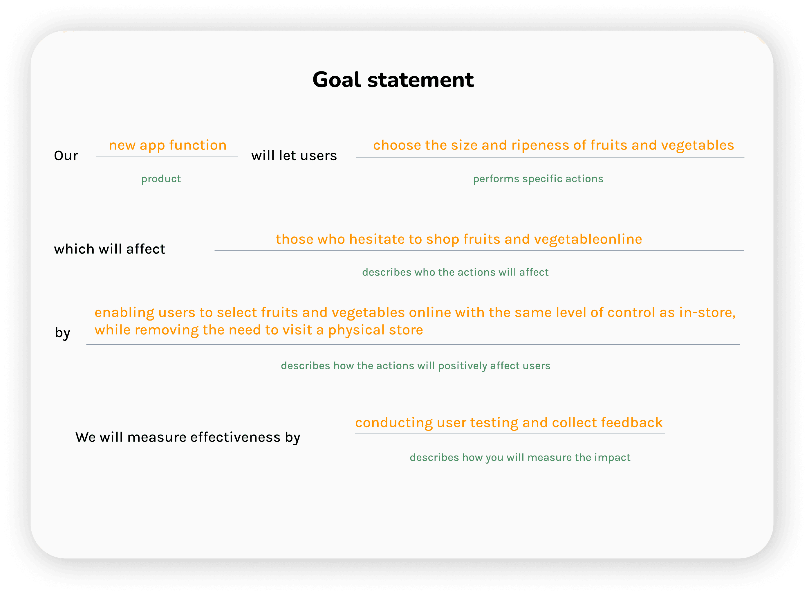
Hence, our design solution is now defined in a Problem statement and a Goal statement as below:
User's flow
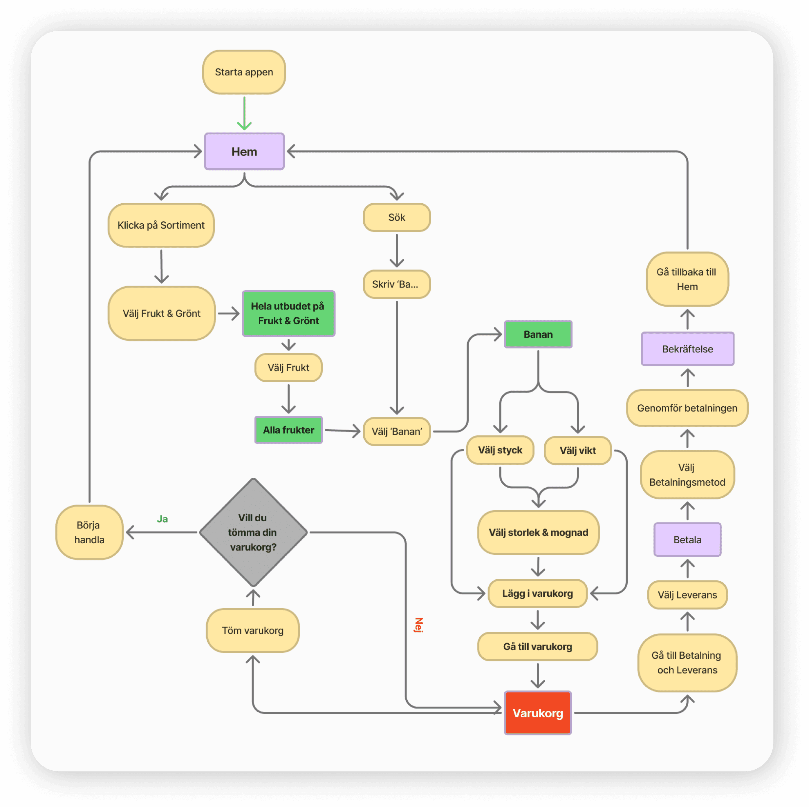
The new feature is designed to integrate seamlessly into an existing grocery app (with features from Coop's app used as inspiration).
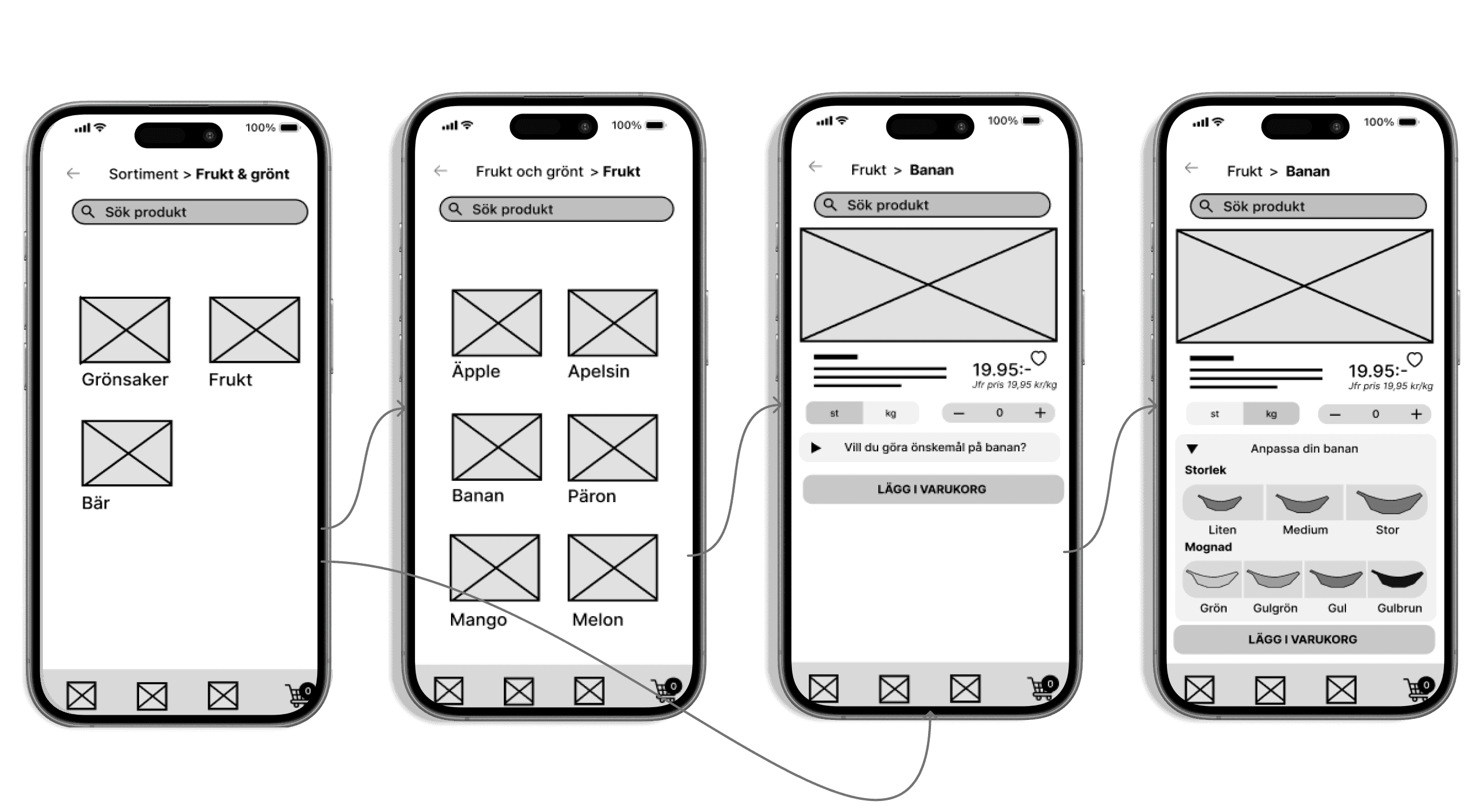
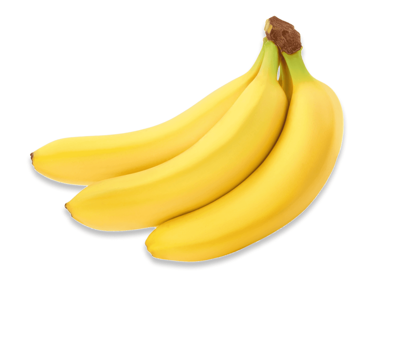
After navigating to the Fruit & Vegetables category, users can select Fruit and search for bananas. On the product screen, they’re then able to customize key attributes—such as size, ripeness, and weight—before adding the item to their cart and proceeding to checkout.
The feature's first sketch on paper
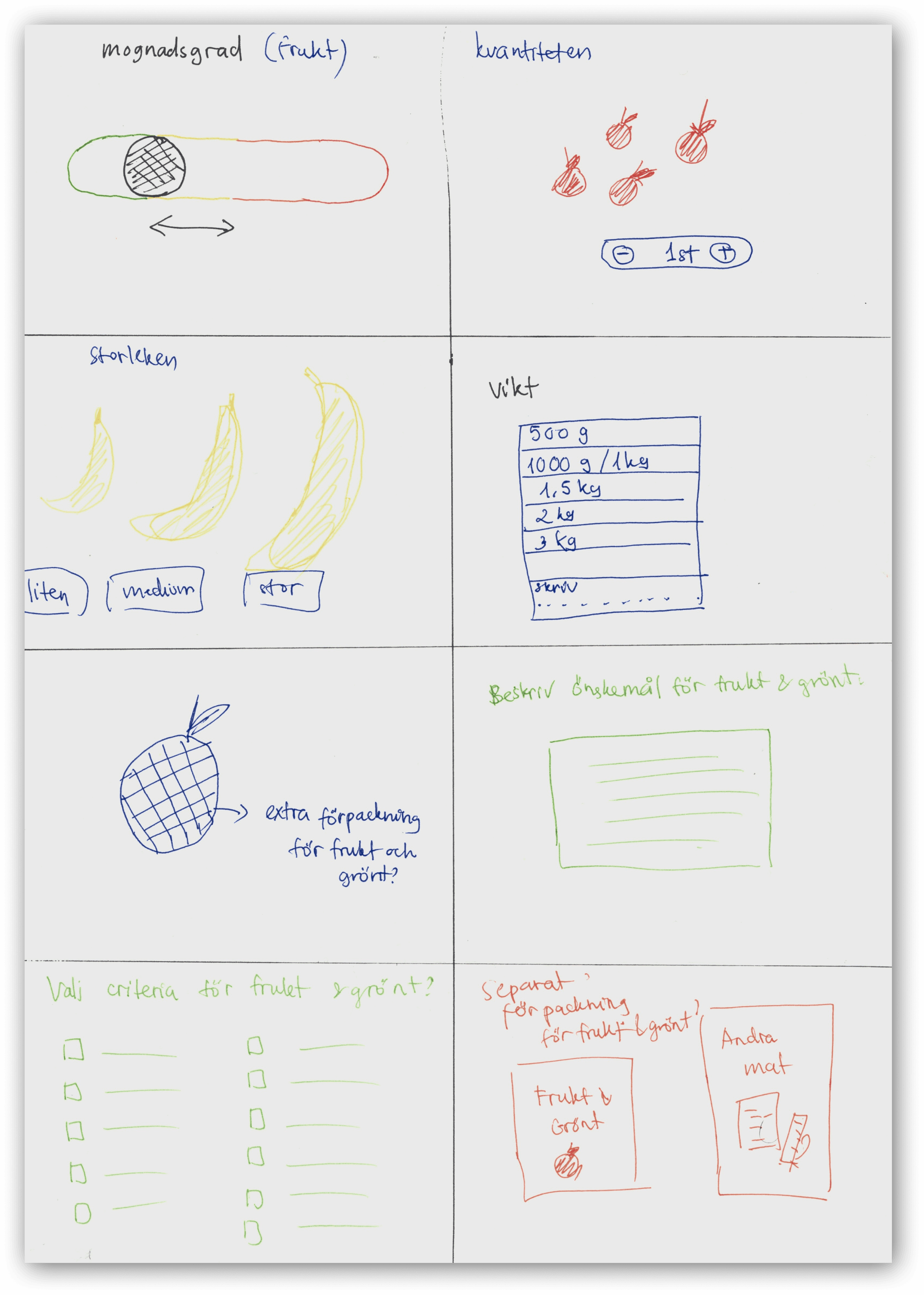
During an ideation workshop, I quickly sketched a range of concepts using the Crazy 8s exercise. Within just eight minutes, a mix of ideas emerged, some better than others, but the goal was to explore broadly rather than refine.
I found this to be a valuable and energizing method in the ideation phase, especially when the aim is to generate a wide range of possibilities and push beyond obvious solutions.
Low fidelity prototype
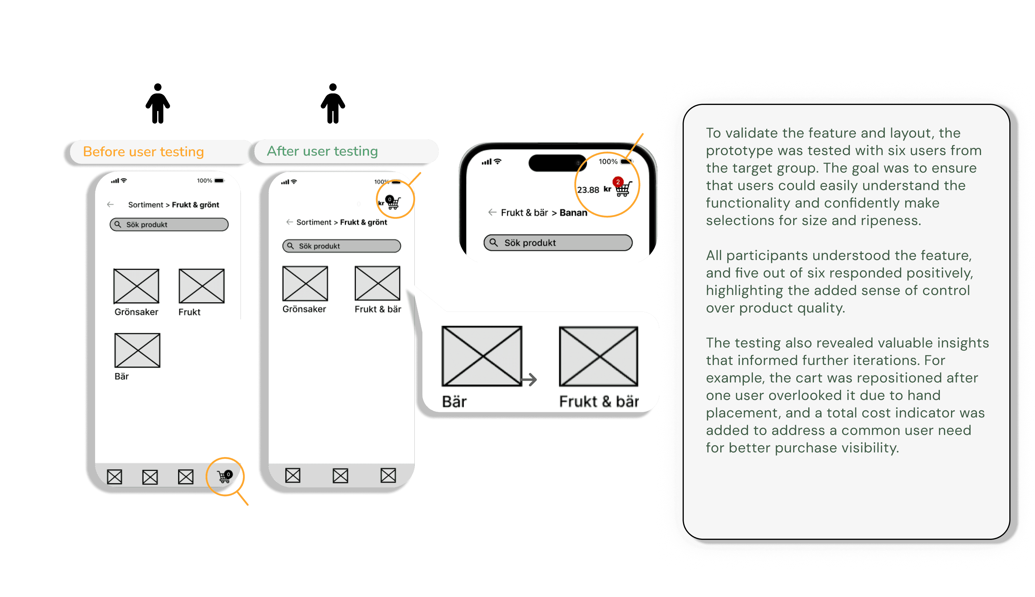
First user testing
MOBILE APP • 2025
Matmys
Desisigning a conceptual grocery app that offers flexible, customizable options for selecting fruits and vegetables
Duration: 3 months
My role: UX Designer
Scope: Conceptual Case Study, Design Thinking Process
Focus: Grocery app, online shopping experience
Duration: 3 months
My role: UX Designer
Scope: Conceptual Case Study, Design Thinking Process
Focus: Grocery app, online shopping experience
Project context
Matmys is a conceptual mobile application designed to bridge the "Trust Gap" in online grocery shopping, specifically focusing on the fresh produce category. The project targets young adults (ages 20-30) in Sweden, a demographic that values convenience but remains skeptical about the quality of digital food sourcing.
Goal
As a UX Designer, my objective was to uncover the underlying reasons why this target group hesitates to shop for groceries online and to design a feature-driven solution that enhances their confidence and engagement with digital platforms.
Project context
Matmys is a conceptual mobile application designed to bridge the "Trust Gap" in online grocery shopping, specifically focusing on the fresh produce category. The project targets young adults (ages 20-30) in Sweden, a demographic that values convenience but remains skeptical about the quality of digital food sourcing.
Goal
As a UX Designer, my objective was to uncover the underlying reasons why this target group hesitates to shop for groceries online and to design a feature-driven solution that enhances their confidence and engagement with digital platforms.
Design thinking process
As UX designer working on the first project, it’s important for me to work in a structured and thoughtful way, because I genuinely care about our users and aim to keep them at the center of everything I do.
I followed a Design Thinking process to ensure I understand our users from the very beginning.
I started with the Empathize phase by conducting in-depth user research, then moved on to Define, Ideate, Prototype, and Test.
Throughout the last three phases, the solution was iterated continuously —to make sure the design truly addressed users’ needs.
Since this was my first UX project, it was important for me to work in a structured and thoughtful way, because I genuinely care about our users and aim to keep them at the center of everything I do.
I followed a Design Thinking process to ensure I understand our users from the very beginning.
I started with the Empathize phase by conducting in-depth user research, then moved on to Define, Ideate, Prototype, and Test.
Throughout the last three phases, the solution was iterated continuously —to make sure the design truly addressed users’ needs.
Empathize
Conducted mixed-method research, combining surveys and user interviews.
Synthesized and analyzed findings to uncover key patterns in user needs, behaviors, and pain points.
Define
Created personas and user journey maps.
Clearly defined problem and solution spaces.
Formulated problem and goal statements
Ideate
Facilitated brainstorming sessions.
Created user flows.
Prioritized features based on user needs.
Prototype
Rapidly sketched paper wireframes based on user flows.
Created low-fidelity prototypes and storyboards in Figma.
Translated low-fidelity concepts into high-fidelity prototypes
Test
Developed test scenarios.
Conducted usability testing and A/B testing on both low- and high-fidelity prototypes.
Collected feedback and iterated on the design
Personas
After synthesizing insights from both interviews and surveys, two key personas were developed representing typical grocery shoppers: Kim, who primarily shops online, and Robin, who prefers the in-store experience.
Empathize
Conducted mixed-method research, combining surveys and user interviews.
Synthesized and analyzed findings to uncover key patterns in user needs, behaviors, and pain points.
Define
Created personas and user journey maps.
Clearly defined problem and solution spaces.
Formulated problem and goal statements
Ideate
Facilitated brainstorming sessions.
Created user flows.
Prioritized features based on user needs.
Prototype
Rapidly sketched paper wireframes based on user flows.
Created low-fidelity prototypes and storyboards in Figma.
Translated low-fidelity concepts into high-fidelity prototypes
Test
Developed test scenarios.
Conducted usability testing and A/B testing on both low- and high-fidelity prototypes.
Collected feedback and iterated on the design

Goals & Needs
Wants recipe inspiration and the ability to easily add ingredients to the cart
Ability to choose the quality of fruits and vegetables (without extra cost)
Lower delivery fees, preferably free delivery
Improved search functionality and a clearer product overview in the app
A smooth and convenient payment method (e.g., Swish)
Problem & Frustration
Does not want to spend time shopping in physical stores
Additional fees and delivery costs make online grocery shopping more expensive
Finds it difficult to locate the right products in the app
Wants to feel and choose fresh fruits and vegetables personally
Often forgets to add items when placing orders
Behaviors & Habits
Prefers ordering groceries online as it saves time and avoids walking around the store searching for deals
Plans purchases based on in-app promotions, with a strong focus on saving money
Completes additional shopping in-store, especially for fresh produce
A Day in Kim’s Life
Kim lives in a house outside central Leksand with their partner and dog. They work full-time with varying hours. A typical day starts at 6:30 AM with coffee and a simple breakfast.
In their free time, Kim enjoys walking the dog in the forest or going on camping trips with their partner. On quieter evenings, they like reading books and watching cooking shows.
When it comes to grocery shopping, Kim usually orders their weekly groceries on their phone and picks them up in-store the following day.
KIM
28 yo
Leksand
Working
Lives in house
Primarily shops online, supplemented by in-store purchases



A Day in Robin’s Life
Robin eats a quick breakfast, packs a lunchbox, and takes the tram to school. After classes, they often meet friends at the gym or play video games together. In their free time, Robin enjoys going to concerts or having a drink with friends.
When Robin needs to shop for groceries, they stop by a local store on the way home. At home, they cook a simple but nutritious meal. Before going to bed, Robin usually watches a TV series.
Behaviors & Habits
Has tried ordering groceries online from various services but chose not to continue
Lives close to a grocery store and prefers shopping in person, finding it more affordable, enjoyable, and inspiring, with the ability to see and feel the products
Uses a handheld scanner to keep track of spending and speed up the checkout process
Often plans meals ahead to prepare leftovers and avoid cooking every day
Problem & Frustration
Finds grocery shopping expensive
Experiences inflexible delivery options
Limited product selection, with little ability to choose based on size and quality
Goals & Needs
Wants grocery shopping to be affordable, convenient, efficient, and of good quality
Ability to view expiration dates, especially items with shorter shelf life
Access to better deals and offers

Primarily shops
in physical stores
ROBIN
22 yo
Göteborg
Student
Lives in
apartment

Painpoints and Key insights
Shipping costs make the onine shopping experience less motivating
Quality of fruit and vegetables is the major concern among users
Delivery time is not flexible and needs planning
After identifying key user pain points and priorities, I facilitated a discussion with the team to define what to focus on. Given the range of challenges uncovered, I advocated for prioritizing the quality of fruits and vegetables as a starting point. As this was a conceptual UX project, I emphasized addressing areas where design could have the most direct impact, rather than factors like shipping costs or delivery times, which depend on broader business and operational decisions beyond the scope of UX.
Hence, our design solution is now defined in a Problem statement and a Goal statement as below:
After identifying key user pain points and priorities, I facilitated a discussion with the team to define what to focus on. Given the range of challenges uncovered, I advocated for prioritizing the quality of fruits and vegetables as a starting point. As this was a conceptual UX project, I emphasized addressing areas where design could have the most direct impact, rather than factors like shipping costs or delivery times, which depend on broader business and operational decisions beyond the scope of UX.
Hence, our design solution is now defined in a Problem statement and a Goal statement as below:
User's flow
The new feature is designed to integrate seamlessly into an existing grocery app (with features from Coop's app used as inspiration).
After navigating to the Fruit & Vegetables category, users can select Fruit and search for bananas. On the product screen, they’re then able to customize key attributes—such as size, ripeness, and weight—before adding the item to their cart and proceeding to checkout.
The feature's first sketch on paper
During an ideation workshop, I quickly sketched a range of concepts using the Crazy 8s exercise. Within just eight minutes, a mix of ideas emerged, some better than others, but the goal was to explore broadly rather than refine.
I found this to be a valuable and energizing method in the ideation phase, especially when the aim is to generate a wide range of possibilities and push beyond obvious solutions.
Low fidelity prototype
First user testing
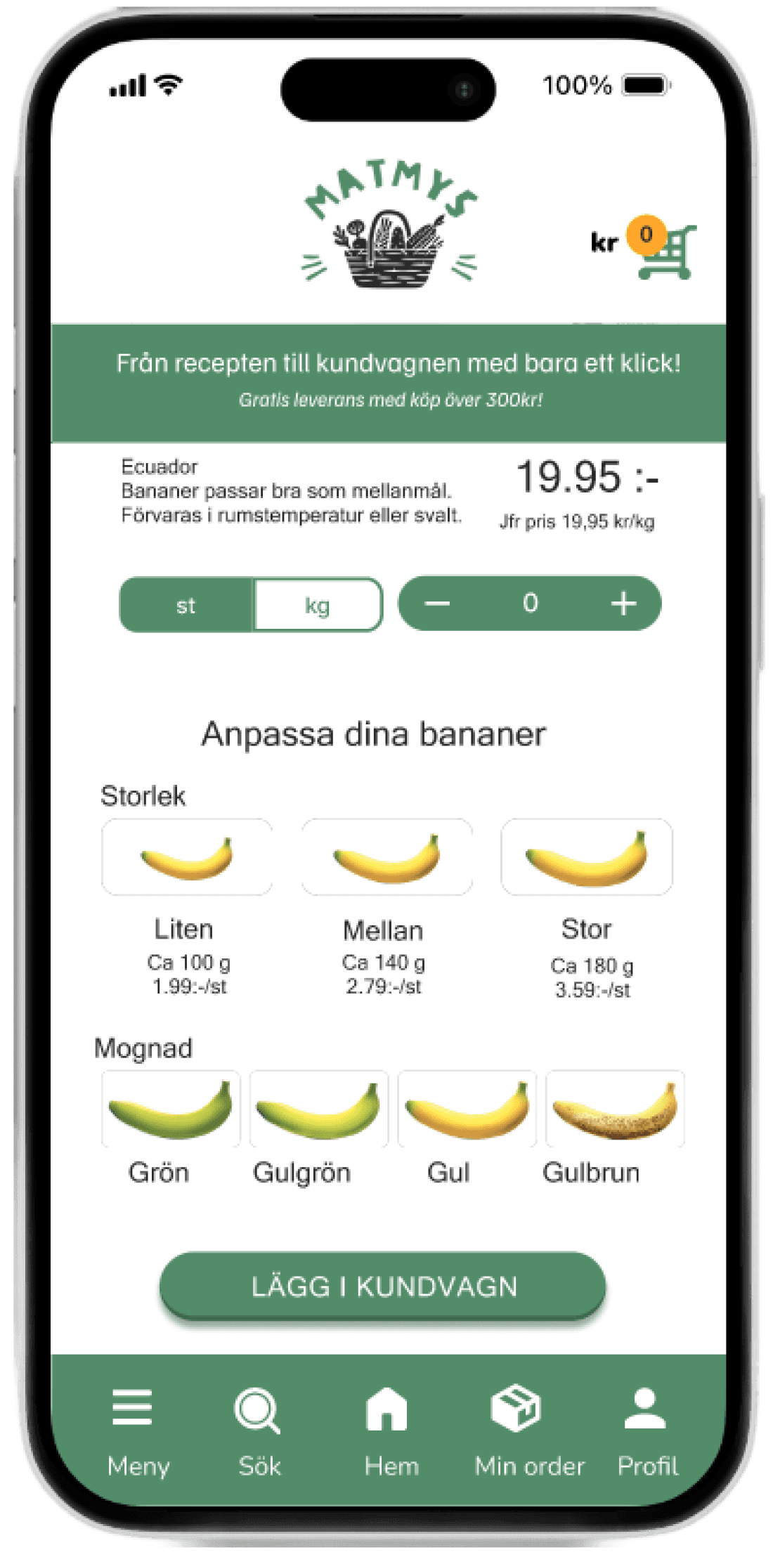
High-fidelity prototype
zinnié
© 2026 zinnie. Curated with intent.
zinnié
© 2026 zinnie. Curated with intent.